World Education Services
For 50 years, WES has helped people learn, work and thrive in new places. Through credential evaluation services and social impact work, they have helped open doors for millions of immigrants, refugees and international students to contribute their skills and talent wherever they are and wherever they go.
Project
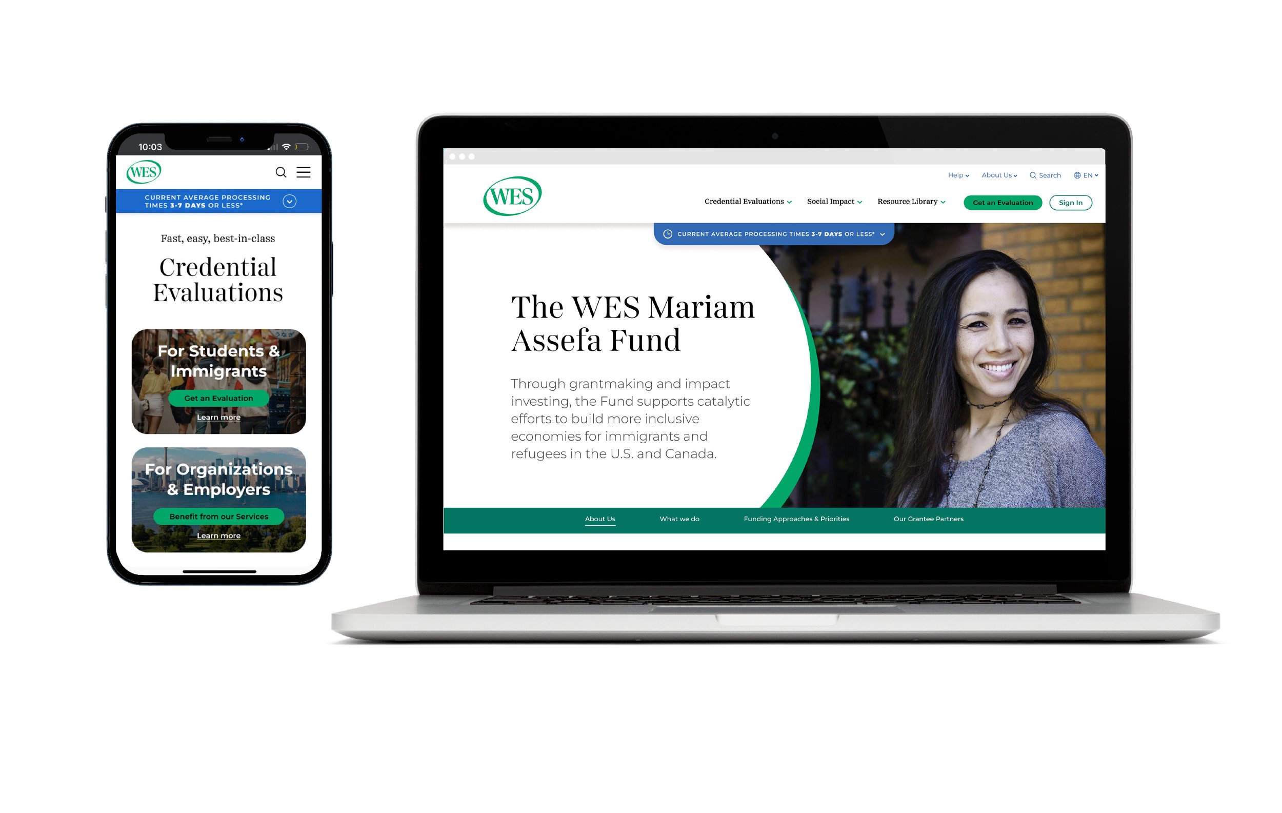
A completely refreshed brand system and new website, with updated brand positioning and messaging.
Purpose
Honor their 50 year history, while looking towards the future of this remarkable social enterprise. Celebrate the humanity, passion and quality of the brand with exciting visuals and language in order to increase their impact and cement their role as an industry leader.
Collaborators
Andrea Jarrell, brand strategy and writing
Storyware, website information architecture and development

Story
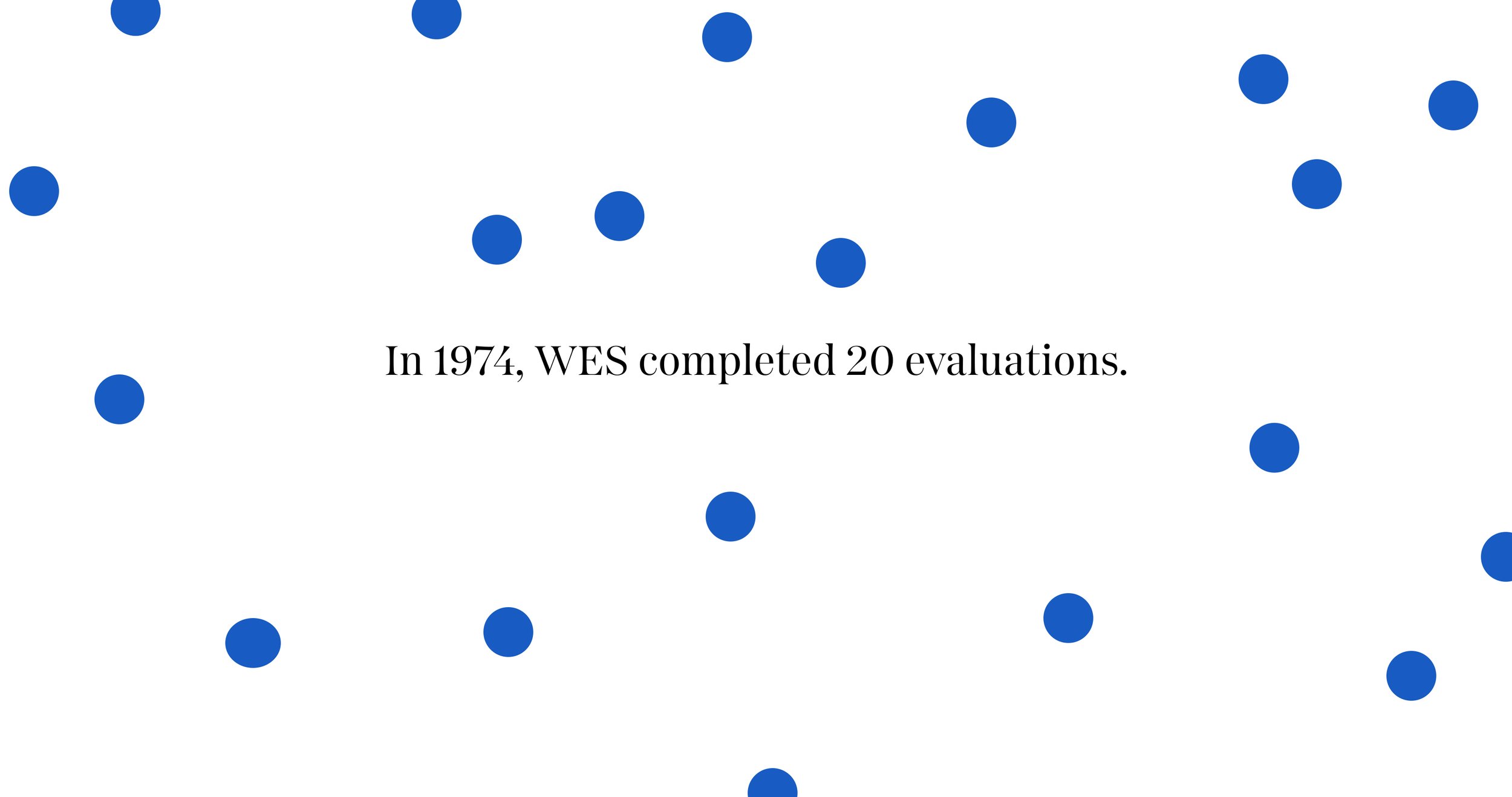
As the organization approached its 50th anniversary in 2024, we were tasked with reimagining the World Education Services brand. We began by familiarizing ourselves deeply with the organization—their work, their audience and their impact. At their founding, WES was a credential evaluation service, providing the ability for immigrants, refugees and international students to learn and work in new countries by assessing their credentials on behalf of educational institutions and governments. They were among the very first organizations to do this type of work. Their work has since expanded to encompass a complex intersection of education, workforce development, advocacy, policy, research, and philanthropy. WES is a trailblazer, helping find and fill gaps to create systemic positive change. They are unafraid of tackling the real issues that face real people all over the world.
So, we created a brand that felt as nuanced, human and passionate as their work. Beginning by dropping their full name in their main logo mark, we helped them confidently own the fact that they are the “Kleenex” of the credential evaluation field. International students and partners often refer to “getting their ‘WES’” as a way of describing their evaluation report.
We added elegance and dimension to their logotype, finessing each letterform. We also added motion and dimension to the iconic “stamp” oval around their logotype. Then, adding bright new colors, and using the oval shape in new ways, we created a visual device that evokes both the journey of their customers traveling to new places, and their role as a connector and collaborator.
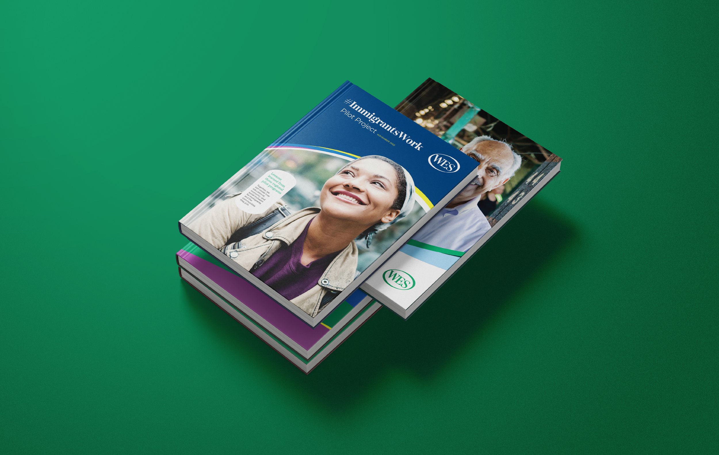
By elevating their brand language, typography and photography, we further shaped their voice and image, clarified their purpose and emphasized their status as an industry leader.
We evolved WES’ brand motif from thin, green intersecting lines to dynamic, colorful, layered shapes.