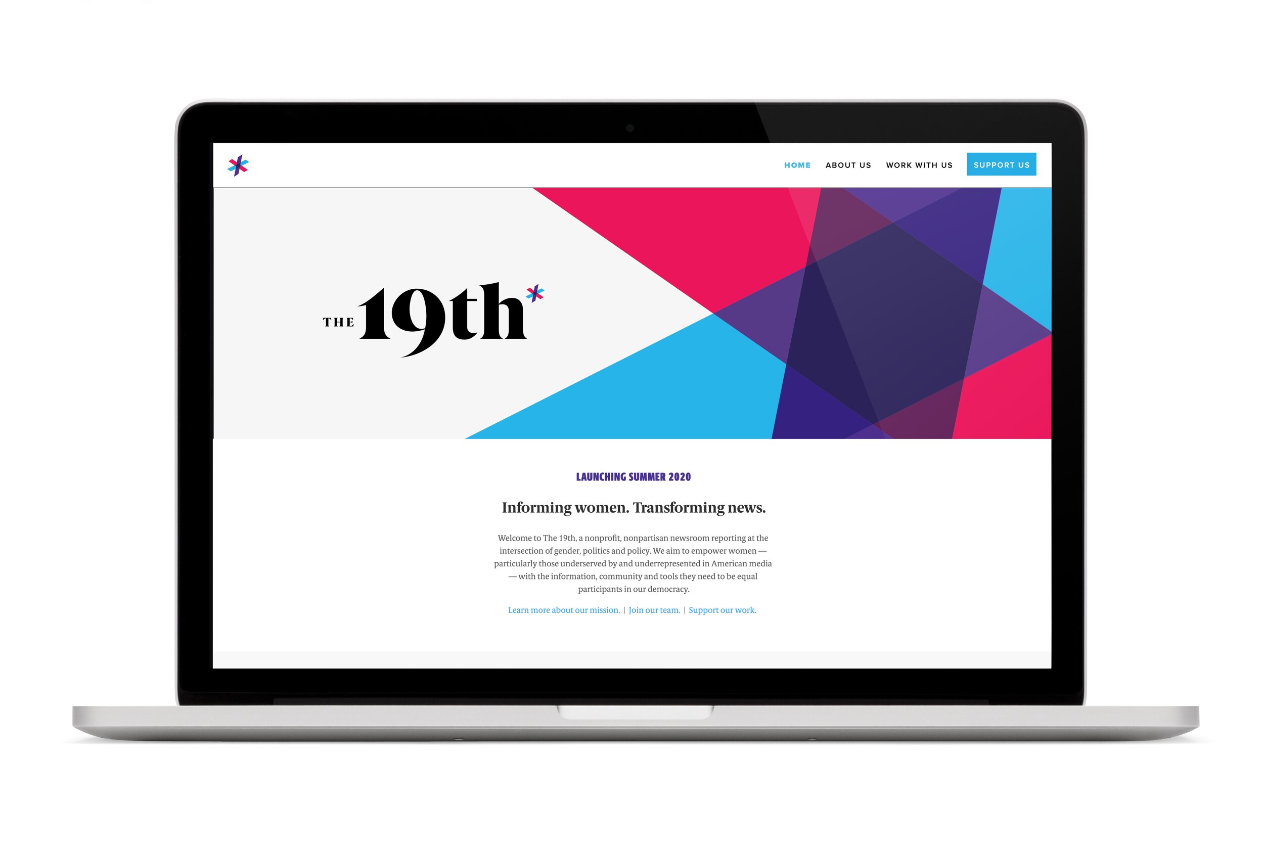
The 19th
A nonprofit, nonpartisan newsroom reporting at the intersection of gender, politics and policy. The 19th aims to empower women — particularly those underserved by and underrepresented in American media — with the information, community and tools they need to be equal participants in our democracy.
Project
Brand Identity System
Purpose
Create a distinctive, flexible identity system for the news organization that represents the mission that they are founded upon: to empower all women to be engaged citizens by providing a news source that puts women at its center.

Story
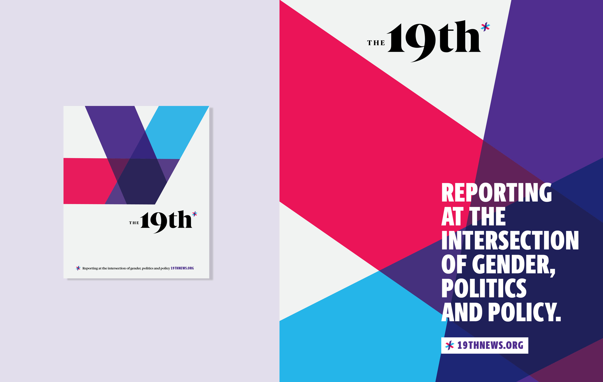
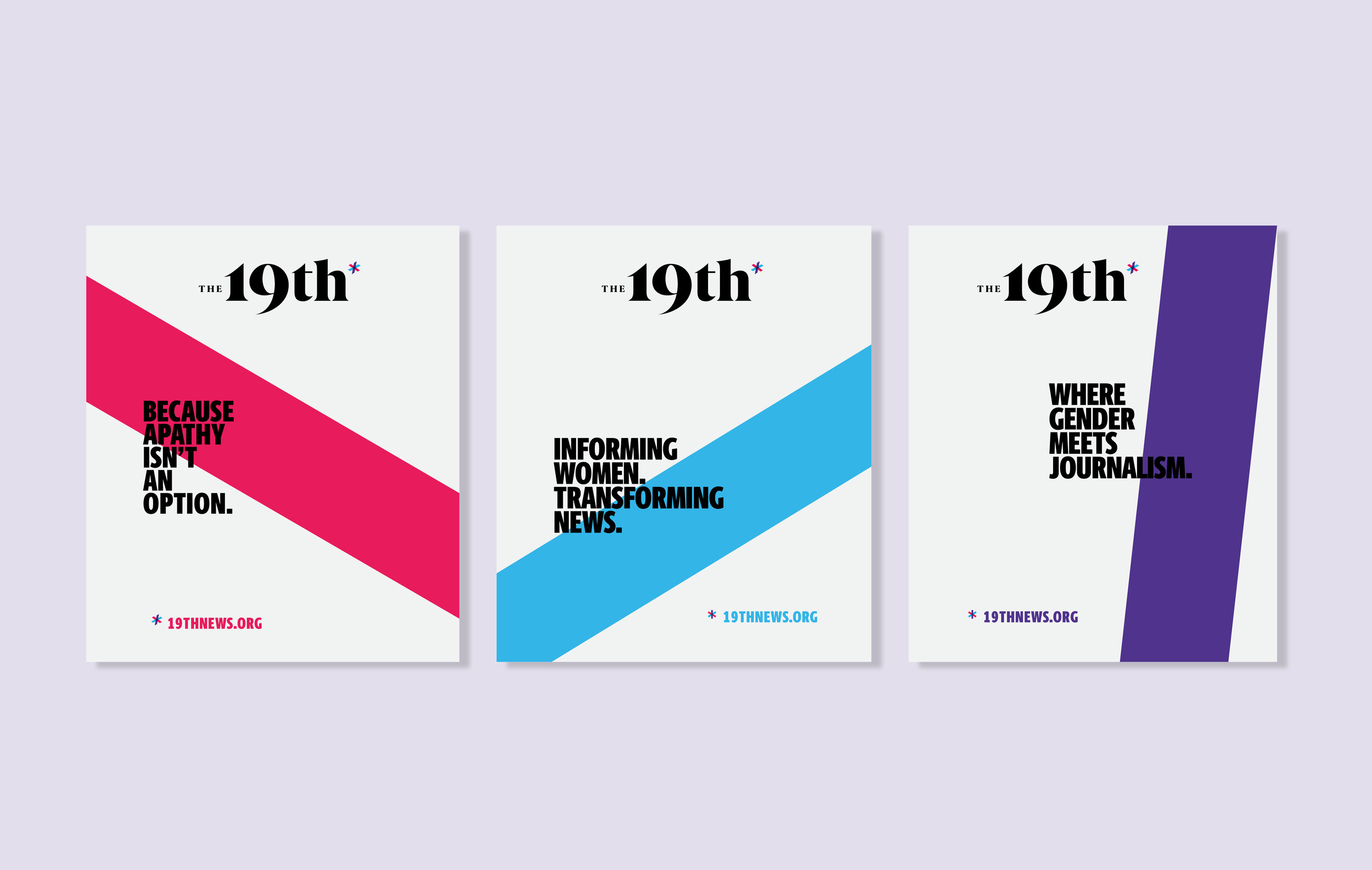
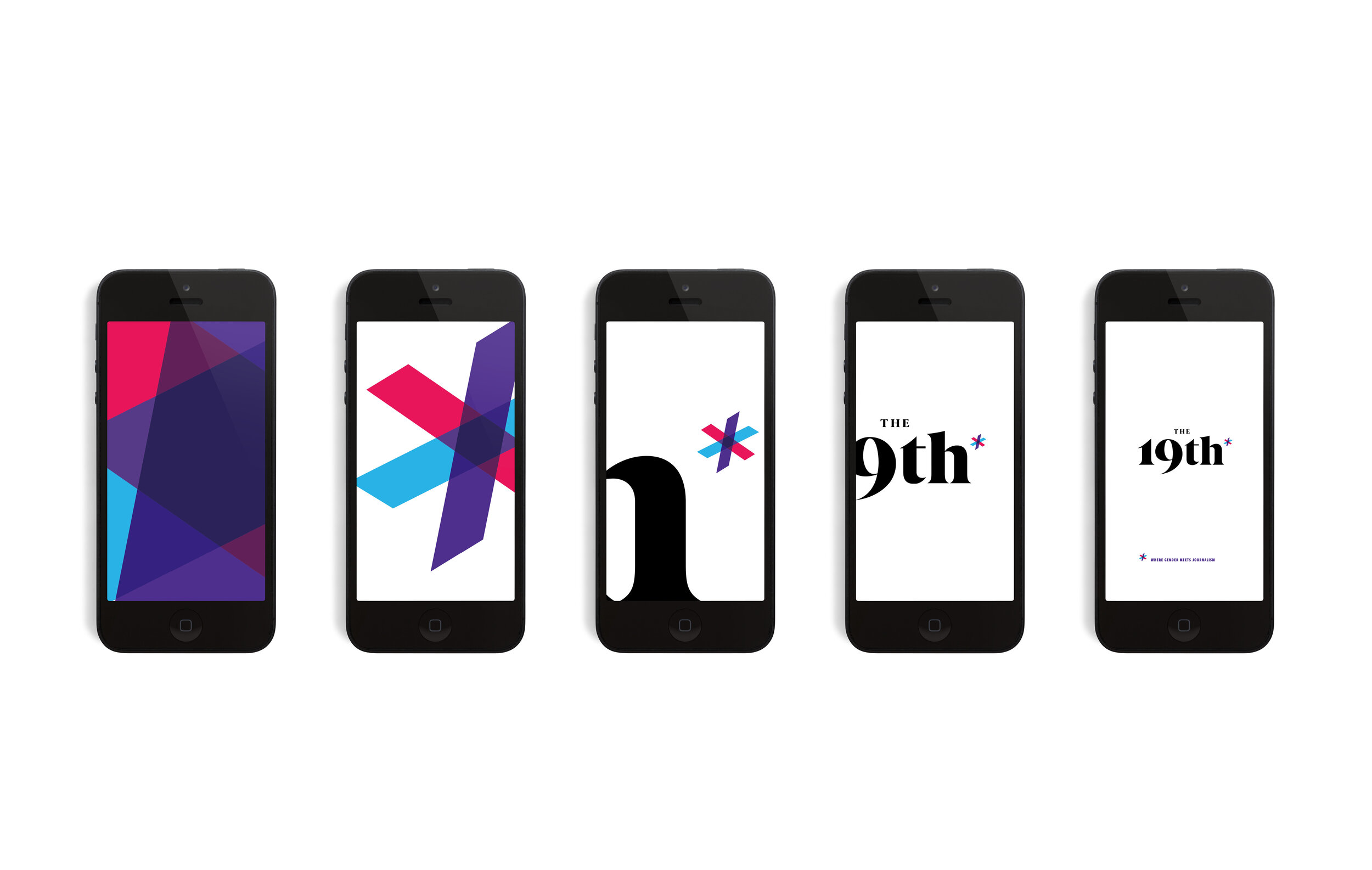
One of the concepts that the 19th team began with was the idea of including an asterisk at the end of their name, symbolizing the “unfinished business” that the 19th amendment left on the table; the notion that while the 19th amendment intended to give all women an equal right to vote, many groups remained hindered in their ability to be equal participants in our democracy. And still today, women as a whole continue to be far underrepresented in newsrooms and the media nationwide.
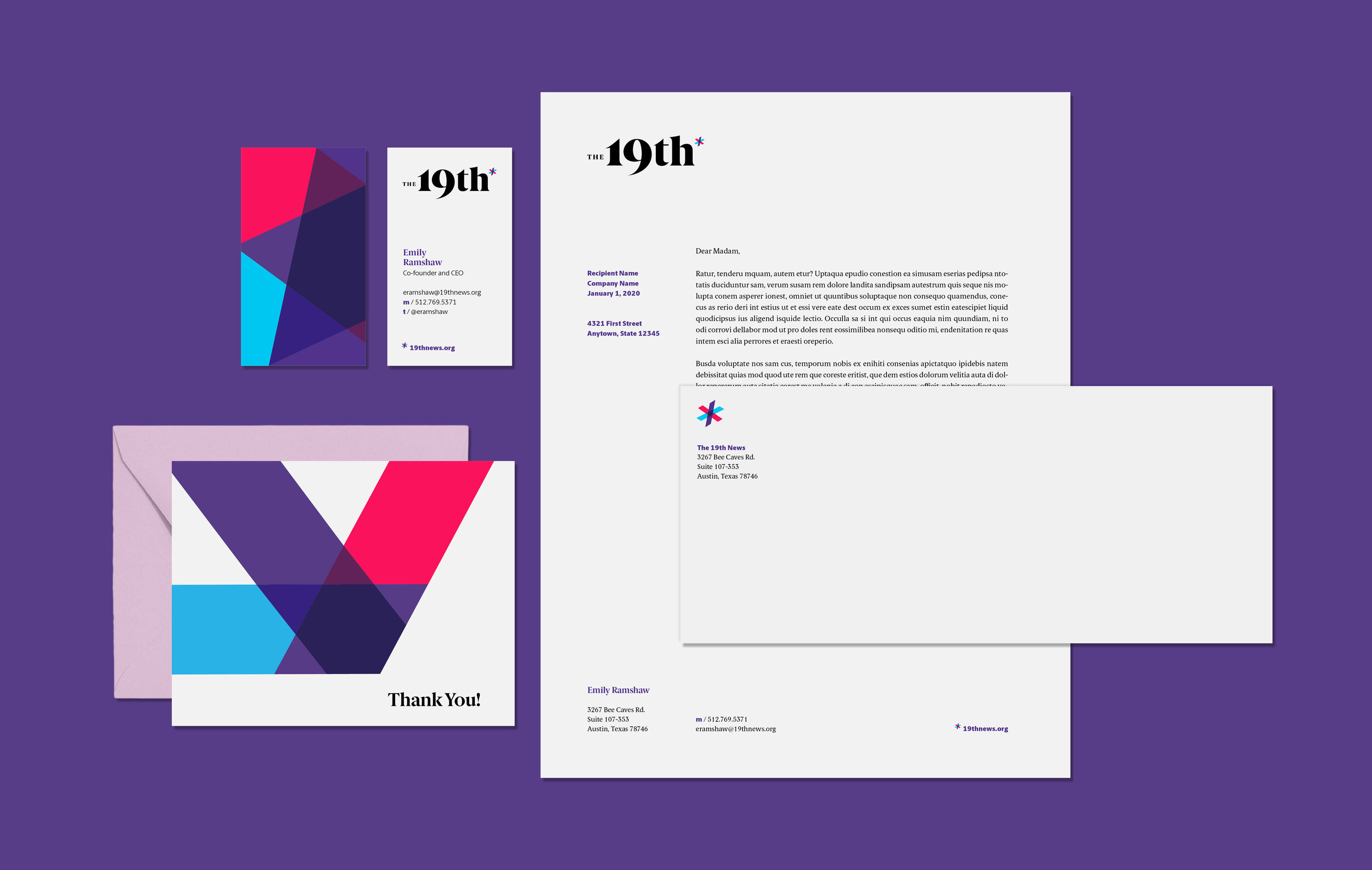
Inspired by the historic document that ratified the 19th amendment, we chose a strong serif typeface (based on Berlingske Serif Black) for the wordmark, one that is modern and distinctive. Berlingske Serif, by Playtype, was created for a Danish newspaper, with specific attention paid to the proportions of the letterforms to maximize readability in the printed paper. This aspect felt particularly appropriate, given the inspiration of the founders as being rooted in the historic physical document.
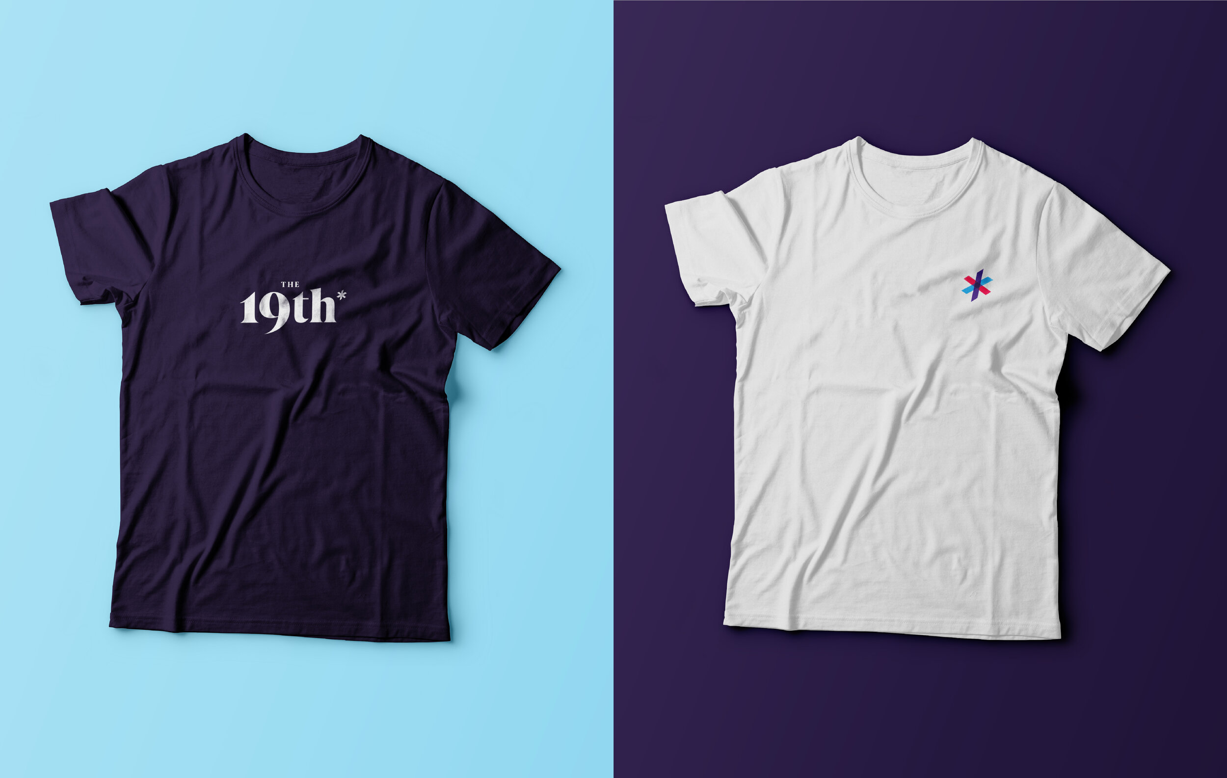
For the asterisk, we were inspired by this idea that the 19th would be “reporting at the intersection of gender, politics and policy.” The asterisk is built with 3 colored planes, intersecting in a way that creates a dynamic, distinctive symbol that represents the core of their mission.
Brand Identity
Visual System
Collateral
Signage